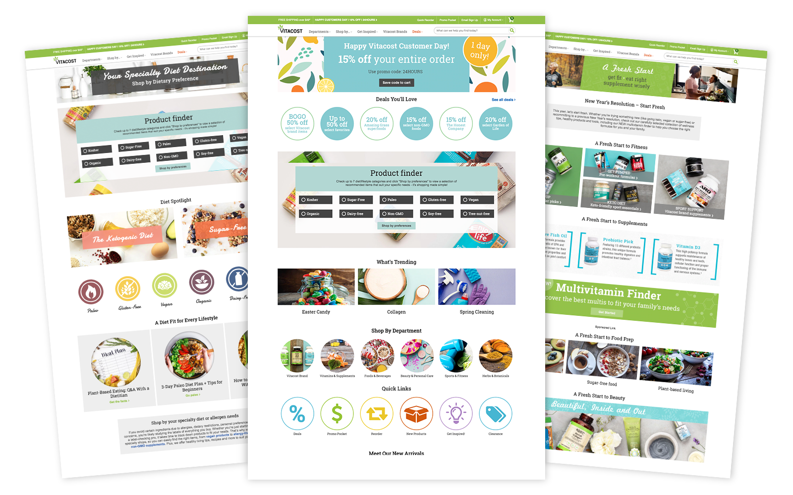
Content Strategy
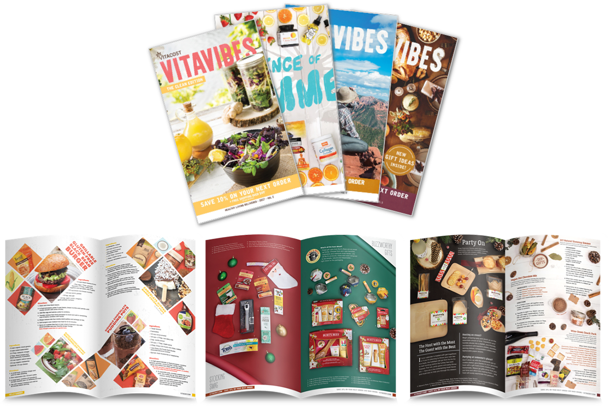
Vitavibes Magazine & Blog
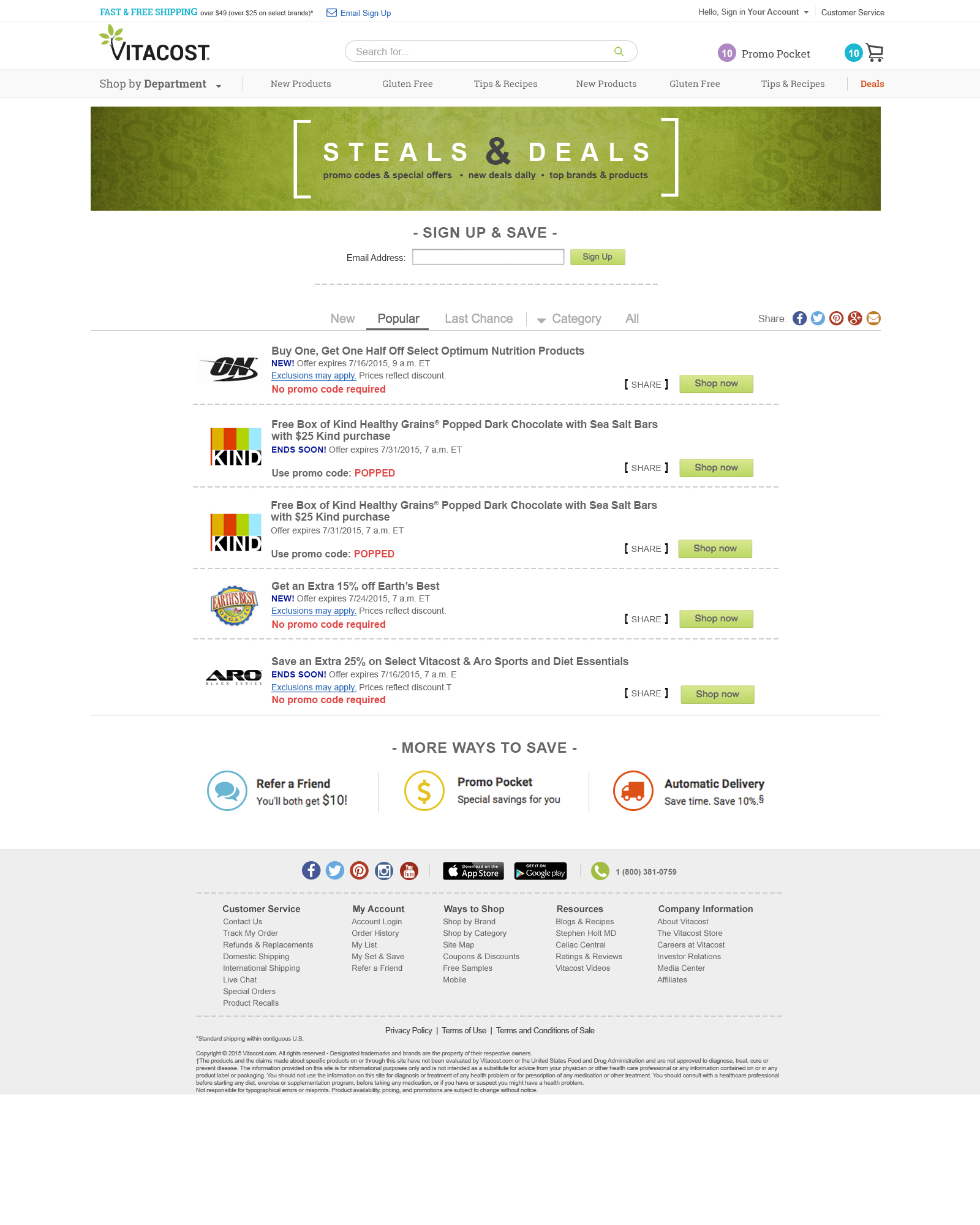
The Vitavibes brand refers to anything content-related. This brand is a safe space away from the shopping experience, and purely about the content and the lifestyle. Any products promoted under this brand are purely from a marketing/story perspective, not led by a revenue goal. We refer to this channel as “inspiration” consistently throughout the shopping experience after running a test that proved that word resonated better than “blog” to customers.
This logo was designed to have a younger, more structured feel than the primary Vitacost logo in order to emphasize the more playful, less commercial nature of the content. Since the brand is recipe-heavy, the logo was designed to have a crafty farmers market or trendy restaurant feel. We also reiterate the word “inspiration” here to tie into the larger content strategy.
Product Design
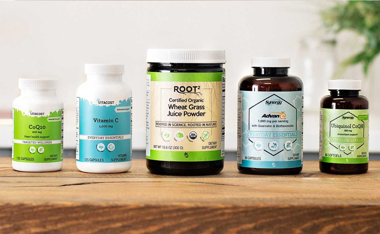
Vitamins: Vitacost, Synergy and Root²
The task: Rebrand, redesign and reorganize over 900 Vitamin and Supplement portfolio of Vitacost's proprietary line.
The solution: The Vitacost Family of Supplement Brands:
Vitacost
Simple, foundational nutrition, exceptional quality and an extraordinary value
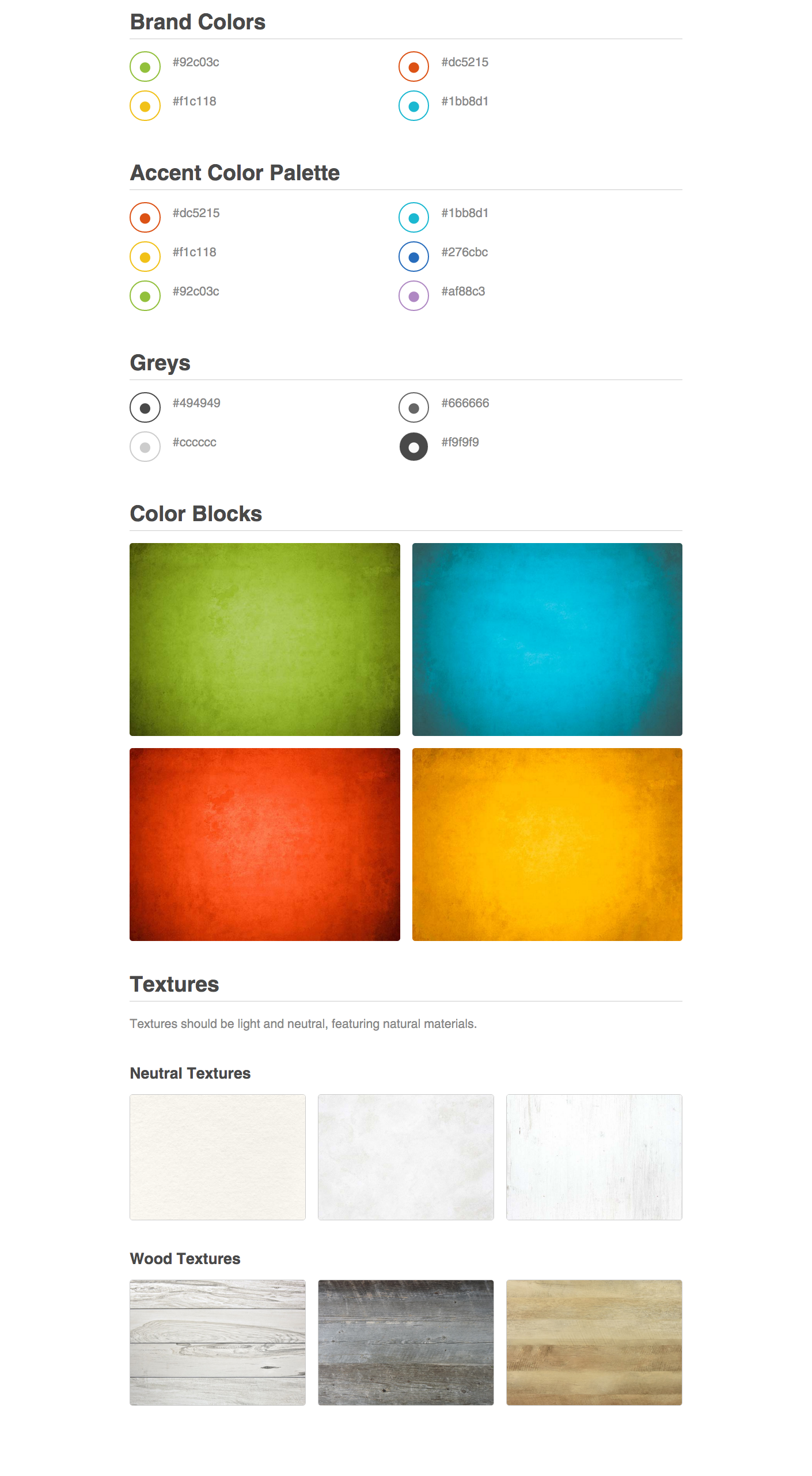
Design direction: Friendly and accessible. Accent color on white. Contemporary pop visuals.
Root²
Natural, whole-food-based ingredients (free of synthetics). Backed by sound scientific research. Meticulously sourced, hand-selected assortment. Specialty/lifestyle needs: organic, non-gmo, vegan and vegetarian options.
Design direction: Woody, earthy neutrals with pops of green; authentic photographs.
Synergy
Next-level nutrition: clinically researched ingredients, higher potency, superior ingredients. Premium, advanced formulas for informed consumers. Specialty items beyond mass-market
Design direction: "Under a microscope" - clean and clinical, utilizing molecular shapes.
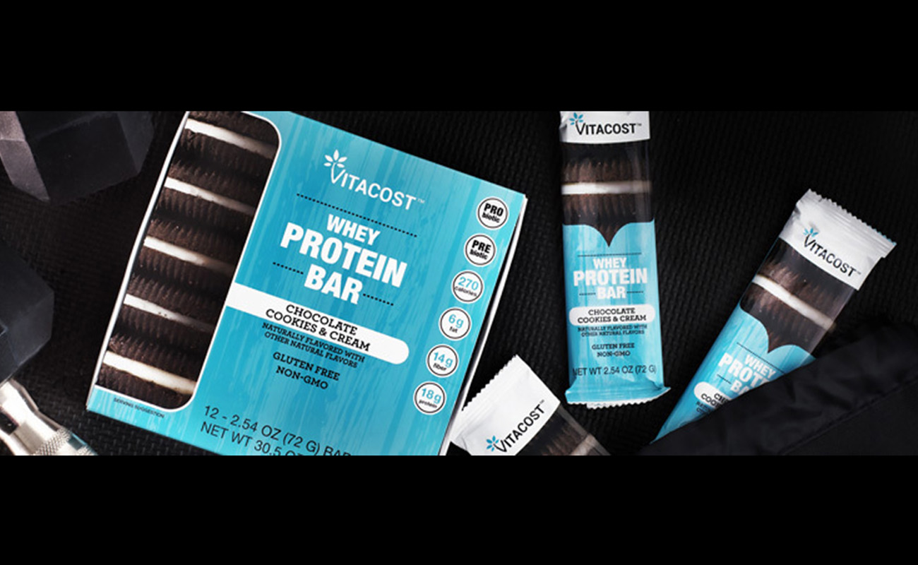
Protein & Snack Bars
Coming 2018
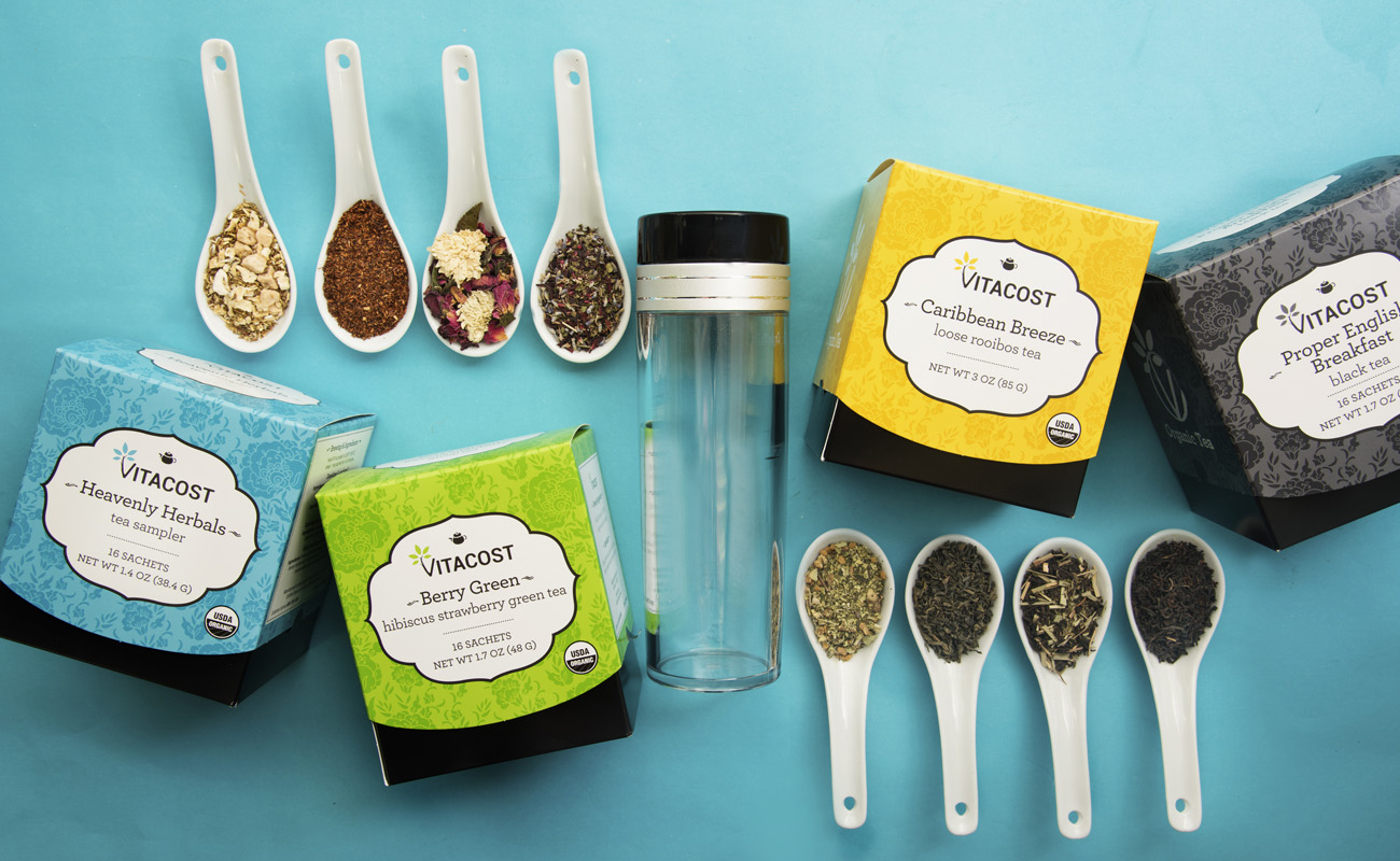
Signature Tea